
There are only a couple more weeks left in the summer after all. Have a great weekend!
Image by Joey Ponce
There are only a couple more weeks left in the summer after all. Have a great weekend!
Image by Joey Ponce


Hip-hop head illustrations by Dale Edwin Murray.
The above shows Kanye, Biggie, Dilla and Flavor Flav. See more including Tupac, Snoop Dogg, excuse me, Snoop Lion and Drake at Dale’s portfolio site here.

I just finished reading Steal Like an Artist by Austin Kleon and I have to say that it’s one of the best books I’ve read in a long time.
It’s full of ten fantastic tips to spark your creativity. I enjoyed it so much that I literally wrote out every major lesson that was stated. I did this to be an active and not passive reader. By rewriting what I had just read, I was able to reinforce the message and allow it to settle into my subconscious.
Every lesson is valuable, but I’ll list those that really hit home for me.
1. Steal like an artist.
There is no such thing as an original idea (peep the video I posted on that here). All creative work came on what was built before. It’s all about putting your own spin and interpretation on what you’ve seen. Remember that bad artists copy, good artists steal.
2. Don’t wait until you know who you are to get started.
I don’t think we ever truly know who we are. The thing is to just start doing whatever it is that interests you. I actually think that’s half the battle. A lot of us don’t start these things because we’re afraid of failure. But what is failure anyhow? It’s better to have tried something than be filled with with the “coulda/woulda” feelings of regret later on. Decide who/what you want to be and then take the steps to become it.
5. Side projects and hobbies are important.
This blog was my hobby to get my mind off of work and actively involved in looking and sharing what I believe to be good design and art. Now that I’m pursuing design as a profession I’m looking to get back into learning how to play the guitar as another way to channel my creative energy.
7. Geography is no longer our master.
I’ve met some of the coolest people online. Get a Twitter account. Start a blog. There’s a whole world filled with awesome like-minded people like yourself. Go find them. Connect, build and collaborate. We are no longer constrained by physical proximity.
9. Be boring. It’s the only way to get work done.
Yes, you read right. Be boring. That might mean not going to that free Little Dragon concert in Prospect Park because you need to make tweaks to your portfolio (I’m still sore over this experience last Friday) or coming straight home after work to work on a freelance project instead of grabbing drinks with friends. It takes a lot of energy, focus and dedication to be good at your craft. Making sure you set aside some down time to work on things. It’s really important.
Check out the book on Amazon here. Happy reading!

I thought this design summed up my summer pretty well. It’s been about a month since I graduated and prior to that I was actively in the trenches of portfolio completion at school. I’m now adjusting to post-graduate life and it’s been tricky. This new life entails looking at a lot of job boards, reaching out to agencies I respect and admire and learning the inner workings of taking on freelance projects.
Taking the step of leaving my media job to pursue design was a huge for me and I’m really excited to see what’s ahead. I know maintaining a positive attitude will be tantamount in my success and while some days are really hard I’m determined to get through it.
I’ve been a bit spotty with this blog for the past several weeks and I want to get back to it starting today. This has served as my visual diary and inspiration board for the past 2 years and it’s now more important than ever that I keep it active.
Ok enough of my rambling. I hope everyone is having a great day!
Side note: I wonder how many different fonts were used to execute the above design. It looks like every letterform is different…
Image via FOT


Select images from Matt Stevens’ Max100 project. The book contains 100 interpretations of Nike’s AirMax 1 kicks which Matt considers to be the greatest sneaker of all time.
To purchase the book and merchandise see here. For more amazing visuals of the work click here.


Really loving the vintage feel on the identity for homemade ice cream shop Jaxon & Mack by Kelly Kerwick. Sometimes the simplest things like the color palette and paper stock make all the difference in a design.
More of Kelly’s work can be seen at her portfolio site here.


Absolutely in love with the hand-lettering of Linzie Hunter. Cute and imaginative. See her portfolio here.

This B.I.G. portrait created by ilustrator Evan Wondolowski. Evan has made a series of portraits from shredded strips of U.S. Federal Reserve Notes, he then glues the paper bits to newspaper sheets. Talk about tedious! Gotta love his attention to detail.
See more from the portrait series here.

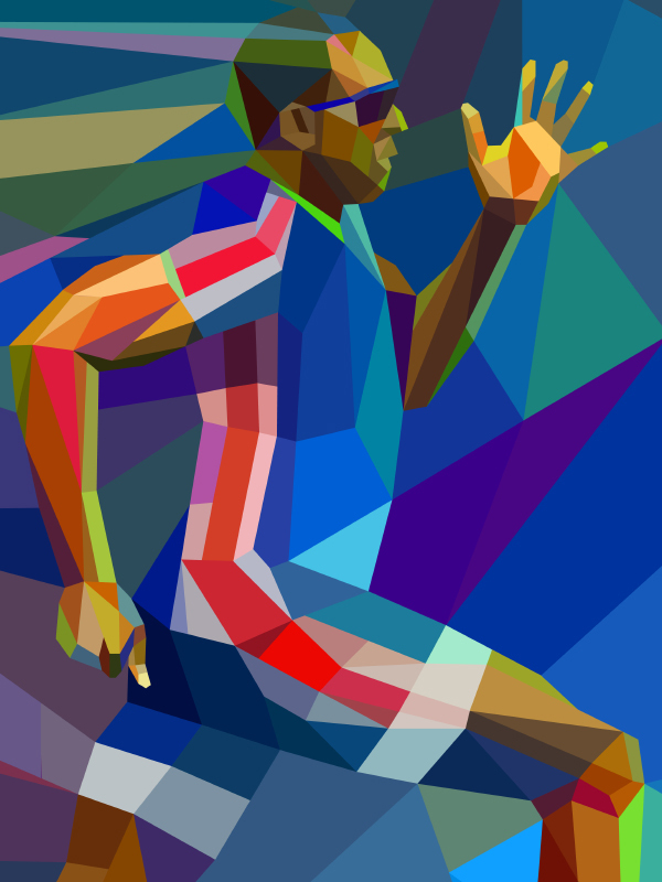
Love these illustrations done by Charis Tsevis for the Yahoo! 2012 Olympic campaign. You may remember some of his work for the Turkey 2010 Olympics as I shared a couple of years ago (see that old post here). More of the campaign can be seen over at Charis’ portfolio site.
From the makers of the documentary Color Outside The Lines, comes the first episode of Under the Needle, a series of short videos on various tattoo artists. Paper Frank, the apprentice of well-known artist Maiya Bailey is the subject of the launch. Here Paper gives some insight into his process as well as advice for those in the market for tattoos.


